See Where Work Piles Up
If you’re new here: OneCamp is a self-hosted workspace (chat, tasks, docs, calls, calendar and AI agents) that you install on your own server. It is open source and free for up to 25 people.
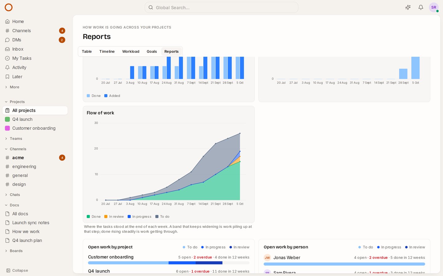
A board tells you where work stands today. It doesn’t tell you whether review has been the bottleneck for three weeks, or whether “in progress” keeps growing because people start more than they finish. For that, teams that run on boards use a cumulative flow diagram. OneCamp’s Reports now draw one.
How to read it
At the end of each week, the chart stacks your tasks by where they stood:
- Done (green) at the bottom: what got done since the report began.
- In review (amber), in progress (blue) and to do (grey, the backlog with it) above it.
Each band uses its status’s colour from the board. Two shapes tell you most of what you need:
- A band that keeps widening is work piling up at that step. If in review grows week after week, reviews are the bottleneck.
- Done rising steadily is work getting through. If it flattens while to do grows, more is coming in than going out.
Where it comes from
Every status change a task has ever had is in its history, so the chart covers the weeks before you updated as well, with nothing to set up. A project’s own statuses count as the stage they belong to: a “QA” status set up as part of review counts as in review. Pick the weeks (4, 12 or 26) and the projects as you do for the rest of the report.
How it compares
Jira draws a cumulative flow diagram among its agile reports. ClickUp keeps its card for the Business plan and up, and Linear its Insights for Business and Enterprise. In OneCamp it’s in every edition, the free one included, next to burndown and velocity for cycles, on your own server.
Try it
- Open the live demo and choose All projects → Reports: the launch’s weeks of history are already there.
- On your own server: onemana.dev/free gives you the install command, no email needed.
- Already running OneCamp? Update to v2.66.0 (with AI) or v1.51.0 (without AI).