OneCamp has colour now, and it's faster where you feel it
If you’re new here: OneCamp is a self-hosted workspace (chat, tasks, docs, calls, calendar and AI agents) that you install on your own server. It is open source and free for up to 25 people.
The last redesign made OneCamp calm. It took the orange off everything that wasn’t a button, and it read well. It also read grey. The feedback was short: it’s bland, and picking a colour theme barely changes anything.
So this round had three parts: give it colour with rules, make it fast where you feel the wait, and then hold every screen to one standard.
Colour that means something
OneCamp now has six colours of its own: sun, moss, lake, sky, dusk and berry. Each one comes in three shades: a strong one for marks, a soft one for backgrounds, and a deep one for text, which stays readable on the soft one. Orange is still the colour that means “press this”.
Everyone and everything has a colour. A person, a project, a channel, a team and a doc each get a colour that stays the same everywhere: avatars without a photo, the marks in the sidebar, mentions, the bar on a quoted reply, calendar events and timelines. If you’ve picked a colour for a project, yours wins.
Charts use one order of colours. It’s sky, berry, sun, lake, dusk, moss, chosen so that neighbouring colours stay apart for people with the common kinds of colour blindness. A series keeps its colour from a report to a table.
A colour theme changes the app. Picking blue or green used to change the unread badges and little else. Now the sidebar and top bar take a wash of the theme, your current place gets a bar and a tint, and switches, checkboxes and progress bars take the theme’s colour. All eleven themes are checked for contrast in light and dark.
Empty screens have a picture. An empty inbox shows a small ringed envelope. A search with no results shows a magnifier. Each one is drawn from the ring in the logo, in under 600 bytes, with no image files.
A few moments get a small celebration: finishing a task, the first message in a conversation, an import that finishes and a setup checklist that’s done. A burst of coloured sparks lasts under half a second. It never plays on routine actions, and it never plays at all if your system asks for less motion.
Faster where you feel it
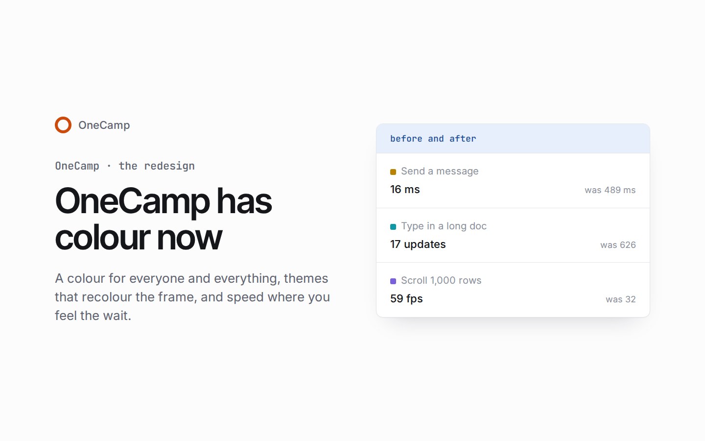
These numbers come from production builds, measured before and after on the same data. Most were taken with the CPU slowed four times, which is how a modest laptop feels.
| What you do | Before | After |
|---|---|---|
| Send a message, until it’s on screen | 489 ms | 16 ms |
| Type a key in a long doc (component updates) | 626 | 17 |
| Type a key in a message box (component updates) | 258 | 68 |
| Switch a project to Board | 312 ms | 48 ms |
| Open the command palette and type | 233 ms | 54 ms |
| Scroll a 1,000-row table | 32 fps | 59 fps |
| Pan a board with 1,000 shapes | 34 fps | 59 fps |
| Open a DM on a phone | 1,242 ms | 782 ms |
Most of this came from one discovery repeated many times: a keystroke, a new message or an update to some unrelated list redrew far more of the screen than changed. In chat the actions toolbar was built under every message, with eleven tooltips each, about 60% of the work of opening a long channel. It’s now built only for the message you point at.
One standard for every screen
The task panel became the reference:
- labels in one column;
- values starting on one line;
- one row height;
- one way to edit a value in place.
Every screen was then shot on a computer and a phone, in light, dark and a colour theme, and measured from the page itself rather than by eye. Some of what that found:
- Tabs that moved the page. Activity’s tabs were three separate builds: one tab was a settings card dropped in whole, and another started 157 pixels further right on some states. Projects, admin and the phone’s top bar had the same problem. 78 cases in all now share one frame per page.
- The Mentions tab had never shown a mention. It read the wrong field of the server’s answer, so it told everyone “No mentions yet”. All, meanwhile, showed 2 of 6 mentions, because two arriving in the same second looked like one.
- Opening a notification took you to a page that didn’t exist. It now opens the message.
- Screens that said “nothing here” when the truth was “couldn’t load”. The admin pages, settings, imports and lists now say what went wrong and offer Try again.
- On a phone, message boxes stay above the keyboard, no field zooms the page when you tap it, Back never leaves the app, and buttons you can tap are 44 pixels.
The onemana.dev site went through the same pass. The checkout page used to draw “Loading…” until its script arrived, and now arrives ready, with its mobile score up from 63 to 94.
Getting it
The live demo already runs it. If you run OneCamp yourself, the web app is built from the release branch, so make update brings all of this in. It’s free for up to 25 people, and the code is on GitHub.